The Lede: What’s (not) happening with new listings in Metro Vancouver?
Something that’s been catching my eye in the market data in recent months is the lack of new listings coming to market, especially as we enter the full swing of the spring market.
This trend has had some knock-on effects, such as slower sales (since you can’t sell what’s not listed), and I’ve noticed “housing pundits” everywhere offering various theories and explanations – many of which seem entirely plausible but tend to rely heavily on anecdotal evidence (e.g., “My client isn’t listing because they can’t find another place to buy”, etc.).
I’m sympathetic to anecdotal evidence because I think people’s on-the-ground experience is always valuable and well-worth considering. The trouble with anecdotal evidence, however, is that it can be hard to summarize into a good chart.
And, well, I’m a sucker for a good chart. And this blog is all about charts!
So, why don’t we add some context to this discussion by starting out with one such chart?
Here’s a plot of new listings in every month of April for Greater Vancouver, going all the way back to the 1980s. I’ve ordered the tallies of new listings from largest to smallest (labeled by year) so that it’s easier to get a sense of where the current pace of new listings ranks in a historical perspective.

We’re not quite at the lowest level for April in history, but we’re ranking 15th from the bottom, which isn’t quite as high as we’ve seen in the recent past. And if your brain works anything like mine does, you might be wondering what the cause(s) behind this trend could possibly be.
I’ll get to my working theory on that in a minute, but first some preamble and (surprise!), more charts.
We're not alone
In my line of work, I come across a *lot* of data, regularly.
Not just housing market data, but all kinds of interest tidbits that I usually scribble a few notes about and stash away for some yet-to-be analysis I’m certain I’ll eventually find myself immersed in.
One example I randomly came across the other day was a (very nice) US housing market data set, and the thought jumped out to me: What about our neighbors down south? Are they also seeing low levels of new listing activity?
Well, let’s take a look!
Here’s a plot of trended new listings data across 48 US states, with the data indexed to January 2022 so we can see if new listings have been trending1 lower or higher over the past year or so.

So that’s interesting.
Our friends south of the border seem to be experiencing a downward trend in new listing activity, at least as far as we can tell from state-level aggregations of the data. It’s possible there’s some regional variation by county and product type, but I’ll leave checking into that for another day.
Oh? Canada?
But what about our own country? What do the data show for other markets in our own backyard?
Let’s take another look!
Here’s another plot of trended data for new listings, but this time focussing on a large smattering of markets in Canada. I indexed the trended data to January 2022 to keep the timeframes comparable with the US data above, and I’ve thickened up the line for Greater Vancouver to make it easier to pick out of the crowd.

Would you look at that – seems like we have some kind of North American synchronicity happening across our respective housing markets.
Which leads me to my (current) working theory on this phenomenon, which I’ll begin with a riddle.
What has:
- Very acute short-run impacts on the housing market?
- A high correlation between the US and Canada (and globally)?
- The smell of money?
Any guesses?
How about mortgage rates?
A testable theory
We know that inflation has been running hot globally, and we also know central banks around the globe have quickly ratcheted up interest rates to fight inflation (almost in unison), which would help explain the synchronicity.
The rise in interest rates has passed through to mortgage rates, and despite the US and Canada having some interesting differences in mortgage lending standards and products2 it seems highly probable this factor is (at least partially) to blame for the synchronous trends in new listings we’re observing on both side of the border.
It’s a plausible theory anyway, and it has the advantage of not being entirely based on anecdotal evidence, so we can test it quantitatively.
I’ll get to that shortly.
No mortgage, no problems
At this point, I’ll stick to speaking about Canada because I’m not an expert in the goings-on of things south of the border, especially as it relates to mortgages.
But as a mortgagor myself, I think I might have a few insights to offer about the pinch of higher rates, and why that may be influencing the trend in new listings that we’re seeing.
To start out, it’s probably sensible to get a better understanding of *who* mortgagors are in Canada. And one thing I always find surprising is that despite home values being what they are in Canada, our country is mostly comprised of household 3 who *don’t* have a mortgage.
Yes, you read that right – 65 per cent of Canadian households do not have a mortgage4 .
These households are comprised of people who own their homes outright (i.e., paid off the mortgage or paid all-cash), or are renter households (who, by definition, also don’t have a mortgage).
Here’s a (Sankey) plot of this breakdown, which I’ve also extended to get sense of the proportion of mortgagor households who are on fixed rate versus variable rate mortgages as well.

What this plot shows is that 65 per cent of Canadian households don’t have a mortgage on their primary residence, while 35 per cent do.
And if we switch this up to exclude renters from the calculation and focus only on home owner households, we end up with:
- 44% of homeowner households who own their home outright, and
- 56% of homeowner households who have a mortgage.
Of those 56 per cent who have a mortgage:
- 71%5 have a fixed rate mortgage, and
- the other 29% have variable rates mortgages.
Age isn’t just a number
Where am I going with all this? Well, think about it this way:
We know we can largely exclude renters from the theory because they don’t own their primary residence and therefore can’t list it for sale. In this sense, it’d be hard for them to contribute to the dearth of new listings, at least on the sell-side (though they may still represent potential home buyers on the buy side).
So that leaves us (primarily) with homeowners. Some of whom have mortgages, and many of whom don’t.
And the picture gets a bit more interesting when we look at the age distribution of homeowners in Canada, broken out by whether they have a mortgage or not:
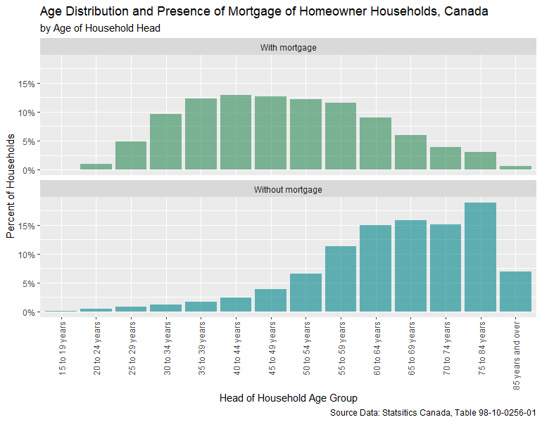
We can see right away that households *with* mortgages tend to be a lot younger than households without mortgages.
This makes perfect logical sense if you think about it for a second, but it also has one very important implication for this theory:
Younger people tend to move *much* more frequently than older people, usually for life-related reasons (i.e., new job, birth of a child, marriage/divorce, etc.).
Don’t budge
But each time a home owning household decides to make a move, there are costs involved. Taxes, fees, legal costs, etc.
One very large and relevant cost is the cost of breaking6 the mortgage and obtaining a new mortgage (usually at a higher principal amount, if “moving up”), which may also be at a (much) higher interest rate.
Since we know roughly 71 per cent of Canadian home owners with a mortgage have fixed-rate mortgages, we also know that those who obtained their mortgage at any time further in the past than about 12 months would face leaving a cushy fixed rate mortgage at about two-to-three per cent, to obtain a new mortgage at about five-to-six per cent if they were to move (or renew).
And once we throw the B-20 stress test into the mix, we’ve got a *very* plausible theory for the dearth of new listings:
Pain for pleasure
All right, we’ve got plausible theory on what might be keeping people from listing their homes.
But to analyze this question in some quantitatively rigorous way, we still need some data on the “financial pain” a mortgagor would endure if obtaining a new mortgage (or renewing) at every point in time historically. We’ll need this data to compare it to new listings activity later to see if there’s some clear pattern or relationship.
This gets a little tricky because I don’t have data on every single mortgagor’s contract, what mortgage rate it was signed at, and how many years they are into their term.
But I do have data on historical mortgage rates.
And I can try to approximate this information by looking at the difference in mortgage rates one would (theoretically) face if obtaining a new mortgage (or renewing), based on how far into their mortgage term they might be.
In Canada, most mortgages have five-year terms, so to simplify this a bit, I’ll just calculate the “renewal pain” for theoretical mortgagors who are one, two, three, four, and five years into the term of their mortgage. I should point out that at five years into their term, they’d be forced to renew even if they chose not to list their home and move.
Here’s a plot of the premium or discount these theoretical mortgagors would face over time:

There are a few interesting things that jump out to me in this chart:
- There were HUGE swings in mortgage rates back in the 1980s.
- Historically, homeowners facing renewal or re-mortgaging have been quite lucky. Mortgage rates have generally been falling since the 1980s, meaning that, most of the time, obtaining a new mortgage or renewal would typically yield a *discount* to their previous contract rate.
- While paling in comparison to the 1980s, the current ramp upward in the premium is quite large, especially compared to more recent history. And we know home values are much higher today than in the past, so even small changes to this measure may have comparatively large impacts at today’s home valuations.
La pièce de résistance
Okay. You’ve waited long enough.
Can we FINALLY test this theory against the data?
Well. Sort of.
This is a blog post and not an academic treatise, so I feel compelled to be completely upfront about some pretty serious limitations with the analysis that follows.
First-off, this analysis only looks at correlations (which aren't sufficient to prove causation). Second, housing markets are complex – and there could be millions of other factors impacting the trend in new listings which simply cannot be quantified.
Anecdotal evidence would be included in that list.
With that disclaimer out of the way, we can (finally) look to see if there’s some obvious correlation between a higher “renewal penalty” and lower levels of new listing activity.
If the theory is that higher renewal penalties are associated with lower levels of new listing activity, then a line drawn through a scatterplot of the data relating these two things together should slope downward, from upper-left to lower-right.
Here’s a scatterplot checking if that’s the case:

We definitely can see the expected negative correlation between the renewal penalty and new listings in the data, and this relationship gets steeper the further a mortgagor is into their mortgage term (because their contract rate is usually much lower than the renewal rate a few years later).
And this is what we’d expect to see in the data if the theory holds any water, so it’s nice to see the data line up with the theory.
But some of the more technically minded readers may note that it’s not the tightest linear relationship, which certainly leaves a lot of room for doubt in the theory.
And they’d be right in pointing that out.
With that said, it’s the best testable theory I’ve got kicking around at the moment based on the data I know of and have access to. And it’s a theory that doesn’t rely purely on anecdotal evidence.
So, hopefully that’s enough to satiate your curiosity.
It’s definitely enough for me (for now), until I stumble upon some other interesting bit of data that might help bring more clarity to this picture.
Until then!
Bonus chart for the extra curious
Technically minded readers might also note that there’s a pocket of data points in the upper left corner of the scatterplots that might be exerting a high degree of leverage, which may be overstating the relationship.
Thinking back on the chart of the historical discount / premium to the contract rate, it’s pretty easy to guess the culprit: the 1980s and its wildly gyrating mortgage rates.
So, for the extra-curious (and myself), I figured I’d include a bonus chart where I filtered the data to start in the 1990s, so that we get rid of the high-leverage points of the 1980s.
Here’s a plot of that:

The expected negative correlation remains robust to this subset of the data, but the effect is certainly less exaggerated than when including the 1980s.
That said, in both cases the data are quite dispersed and not tightly clustering along the line of best fit, suggesting a fairly weak relationship and/or the presence of other confounding factors.
So, it’s not a perfect theory.
But what can I say? Housing markets are complex!
[1] I’m using trended data because new listings time-series data are seasonal. Using the trended data allows us to adjust for seasonality and get a clearer picture of the underlying trend.
[2] Notably, Americans can lock in a mortgage rate for the entire term of the mortgage (usually 30 years) and can also deduct mortgage interest payments from income. Canadians can only dream of such luxuries!
[3] I’ll be using the term “household” frequently, and I’ll be sticking to the Statistics Canada definition of the term, which is roughly: “a person or group of persons who occupy the same dwelling and do not have a usual place of residence elsewhere in Canada or abroad”.
[4] These stats are based on calculations prepared by the Bank of Canada in their 2022 Financial System Review. Readers familiar with Statistics Canada Census data may note slight differences in the Bank of Canada calculations versus the Census figures.
[5] If the math seems confusing, here’s a quick explainer of these last figures: 35 per cent have mortgages, and 25 per cent of that (25+10) = 35 per cent are on fixed rate, while 10 per cent are on variable. So, the math is: 25/35 = 71 per cent, and 10/35 =29 per cent.
[6] Breaking a mortgage early before the end of the term usually also incurs a mortgage-breaking penalty. For fixed rate mortgages, this is typically the greater of the “Interest Rate Differential” (IRD) or three-months interest. For variable rate mortgages, the penalty is typically three-months interest.